Diagrams
Diagrams are a great way to visualize the pipeline and understand the flow
of data. DataJoint diagrams are based on entity relationship diagram (ERD).
Objects of type dj.Diagram allow visualizing portions of the data pipeline in
graphical form.
Tables are depicted as nodes and dependencies as directed
edges between them.
The draw method plots the graph.
Diagram notation
Consider the following diagram
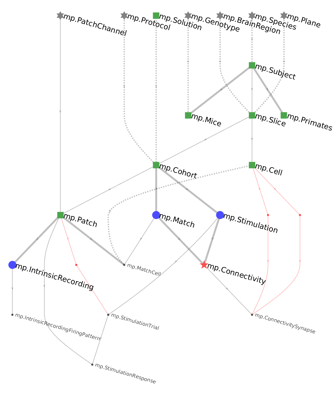
DataJoint uses the following conventions:
- Tables are indicated as nodes in the graph. The corresponding class name is indicated by each node.
- Data tiers are indicated as colors and symbols:
- Lookup=gray rectangle
- Manual=green rectangle
- Imported=blue oval
- Computed=red circle
- Part=black text The names of part tables are indicated in a smaller font.
- Dependencies are indicated as edges in the graph and always directed downward, forming a directed acyclic graph.
- Foreign keys contained within the primary key are indicated as solid lines. This means that the referenced table becomes part of the primary key of the dependent table.
- Foreign keys that are outside the primary key are indicated by dashed lines.
- If the primary key of the dependent table has no other attributes besides the foreign key, the foreign key is a thick solid line, indicating a 1:{0,1} relationship.
- Foreign keys made without renaming the foreign key attributes are in black whereas foreign keys that rename the attributes are indicated in red.
Diagramming an entire schema
To plot the Diagram for an entire schema, an Diagram object can be initialized with the schema object (which is normally used to decorate table objects)
import datajoint as dj
schema = dj.Schema('my_database')
dj.Diagram(schema).draw()
or alternatively an object that has the schema object as an attribute, such as the module defining a schema:
import datajoint as dj
import seq    # import the sequence module defining the seq database
dj.Diagram(seq).draw()   # draw the Diagram
Note that calling the .draw() method is not necessary when working in a Jupyter
notebook.
You can simply let the object display itself, for example by entering dj.Diagram(seq)
in a notebook cell.
The Diagram will automatically render in the notebook by calling its _repr_html_
method.
A Diagram displayed without .draw() will be rendered as an SVG, and hovering the
mouse over a table will reveal a compact version of the output of the .describe()
method.
Initializing with a single table
A dj.Diagram object can be initialized with a single table.
dj.Diagram(seq.Genome).draw()
A single node makes a rather boring graph but ERDs can be added together or subtracted from each other using graph algebra.
Adding diagrams together
However two graphs can be added, resulting in new graph containing the union of the sets of nodes from the two original graphs. The corresponding foreign keys will be automatically
# plot the Diagram with tables Genome and Species from module seq.
(dj.Diagram(seq.Genome) + dj.Diagram(seq.Species)).draw()
Expanding diagrams upstream and downstream
Adding a number to an Diagram object adds nodes downstream in the pipeline while subtracting a number from Diagram object adds nodes upstream in the pipeline.
Examples:
# Plot all the tables directly downstream from `seq.Genome`
(dj.Diagram(seq.Genome)+1).draw()
# Plot all the tables directly upstream from `seq.Genome`
(dj.Diagram(seq.Genome)-1).draw()
# Plot the local neighborhood of `seq.Genome`
(dj.Diagram(seq.Genome)+1-1+1-1).draw()